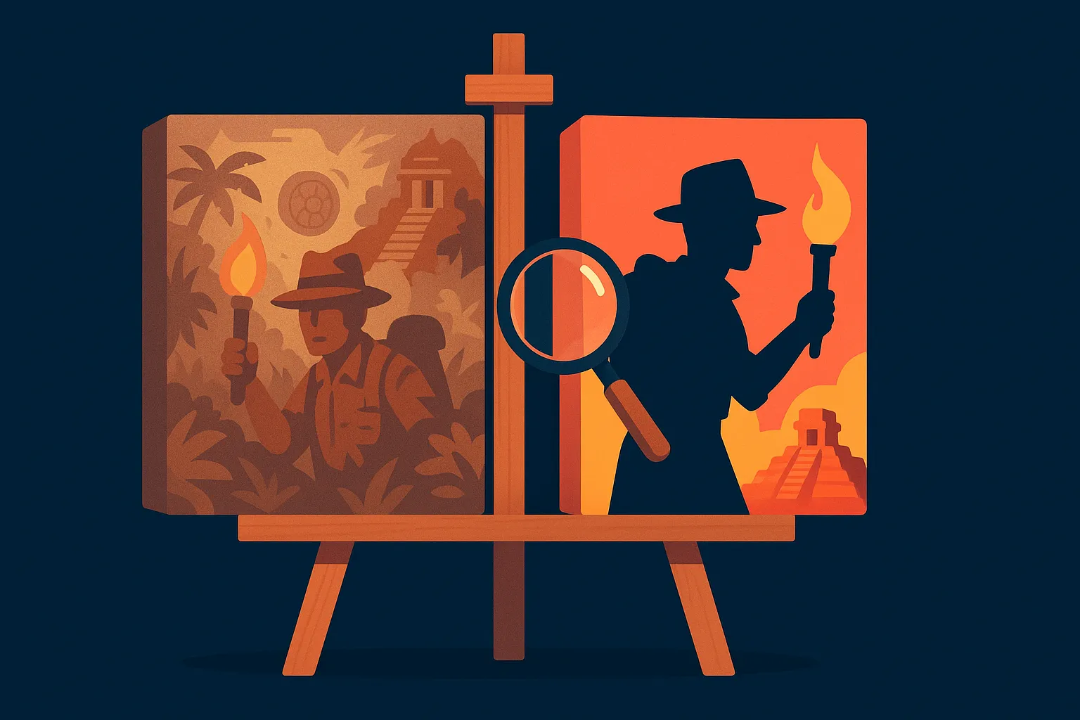
Box art and card art do different jobs, and treating them as one line item is why a lot of campaign art underperforms. Box and thumbnail art exist to stop the scroll and signal genre in under a second, at a size where fine detail is invisible. Card and component art exist to prove depth and quality once someone is already reading the page. Budget and brief them separately, because the skills, and the review process, are not the same.
A backer scrolling Kickstarter's discovery feed sees your thumbnail for less than a second before deciding whether to stop. That single image has to do more work than any other asset you will commission, and most first-time creators brief it the same way they brief interior card art, as one undifferentiated "game art" line item handed to one illustrator on one timeline. It shows in the results: campaigns with strong component art and a weak thumbnail routinely underperform campaigns with simpler art and a thumbnail that reads instantly at a hundred pixels wide.
The thumbnail's only job: stop the scroll in under a second
At thumbnail size, fine detail is invisible. What survives the size reduction is silhouette, contrast, and color. A box cover crowded with small figures and fine linework looks like a smear of texture at a hundred pixels wide, while a cover built around one strong central shape, a clear light source, and two or three dominant colors reads instantly, even before someone consciously registers what the game is about. This is the same principle movie poster design and mobile game icon design have used for decades, and it applies just as directly to a Kickstarter thumbnail, because the viewing conditions are nearly identical: small, fast, competing against a dozen other thumbnails in the same scroll.
Genre signaling matters as much as raw legibility. A horror game's cover should read as horror in silhouette alone, dark palette, sharp shapes, negative space used deliberately. A family party game should read as approachable and bright before anyone reads a single word of the title. When cover art tries to be moody and premium for a game that is actually light and silly, or bright and cheerful for a game that is actually a brutal strategy title, it sets an expectation the page then has to spend paragraphs correcting.
Why hobby audiences distrust box art on sight
Tabletop backers, especially on the heavier end of the hobby, have seen thousands of campaign pages, and they have developed a fast, mostly subconscious filter for generic art that signals a rushed or under-resourced project. Stock-feeling fantasy tropes, a lone hooded figure holding a glowing object, muddy color separation where the subject blends into the background, and cluttered compositions with no clear focal point all read as warning signs before a backer has consciously evaluated anything about the game itself. None of that means every game needs a painted, gallery-quality cover. It means the cover needs a clear point of view and enough polish that it does not read as an afterthought.
Color separation deserves special attention because it is the most common failure point we see. If the foreground subject and the background sit in a similar value range, dark on dark, or busy on busy, the whole image collapses into noise at thumbnail size even when it looks fine full-screen on the artist's monitor. Testing a cover by shrinking it to thumbnail size and squinting at it, or genuinely stepping back from the screen, catches this failure mode faster than any amount of full-resolution review.
What card and component art is actually for
Once someone has stopped scrolling and landed on your page, the job changes. Card art, board art, and component photography now exist to prove the depth and production value that justify the pledge, not to win a half-second glance. This is where a backer who already clicked in evaluates whether the game looks like it will hold up over dozens of plays, whether the components look premium enough to justify the price, and whether the visual identity is consistent enough to suggest a team that sweats details.
Consistency matters more here than raw individual illustration quality. A deck where every card looks like it was illustrated by a different artist working from a different brief reads as unfinished, even if any single card looks great in isolation. A strong page uses a tight, consistent visual language, shared color palette, consistent linework or rendering style, unified iconography, so the whole product feels like one considered object rather than a collage of separately commissioned pieces.
Budgeting art like a campaign asset, not a vanity spend
Concept art and production art are different phases with different costs, and skipping the concept phase to save money is one of the most common ways creators end up paying twice. A round of rough concept sketches, thumbnails exploring composition and color before any final linework begins, costs a fraction of full production art and catches a weak composition before real money goes into rendering it. Creators who skip straight to a finished piece and then decide the composition is not working end up paying for a second full pass instead of a cheap round of revisions.
Budget ranges vary enormously with scope, but as a rough shape: a handful of icon-style illustrations for a small card game can run a few thousand dollars total for a complete set, while a fully painted box cover from an illustrator experienced in tabletop can run well into four figures for that single image alone. A full deck of unique card illustrations for a mid-size game, plus a painted cover and board art, is where budgets commonly reach five figures. None of that is optional spend to trim first when a budget gets tight, because thumbnail and page art are doing acquisition work that no amount of copywriting can fully replace.
| Scope | What's included | Rough cost |
|---|---|---|
| Concept pass | Rough sketches or thumbnails for composition and color, before final linework | A few hundred to low thousands |
| Cover / box art only | One finished, painted or fully rendered cover illustration | Low to mid four figures |
| Full card set (small game) | Icon-style or simplified illustrations across a small deck | Low to mid four figures total |
| Full card set (mid-size game) + cover | Unique illustrations across a full deck, plus painted cover and board art | Five figures |
What actually separates art that converts from art that doesn't
Across the campaigns we have supported, the pattern is consistent enough to state plainly: covers that convert well share a single dominant subject, deliberate color separation between subject and background, and a palette that reads correctly at thumbnail size before any full-resolution detail comes into play. Covers that underperform tend to share the opposite, cluttered compositions with no single focal point, low contrast between subject and background, and a tone that does not match what the game actually is once you start reading. The fix in nearly every underperforming case we've reviewed was not "hire a better artist," it was simplify the composition and fix the color separation, both of which are art direction problems, not talent problems.
The practical test costs nothing: shrink your current cover to the size it will actually appear at in a feed, roughly 300 pixels wide, and look at it next to five other campaigns in your category. If it disappears into the row instead of standing out, the fix is almost always contrast and composition, not a full re-illustration.
- Brief thumbnail art and interior card art as separate jobs with separate goals, not one undifferentiated line item.
- Test your cover at actual thumbnail size before finalizing it, don't judge it only at full resolution on your monitor.
- Build in a cheap concept pass before paying for full production art.
- Keep card and component art visually consistent, shared palette and style, rather than a collage of separately commissioned pieces.
- Fix color separation and composition before assuming the problem is illustration talent.
- Match tone to genre in silhouette alone, before any text is read.
Frequently Asked Questions
What's the difference between thumbnail art and card art on a Kickstarter page?
Thumbnail art has to stop the scroll and signal genre in under a second, at a size where fine detail disappears. Card and component art has a different job, proving depth and production quality once someone has already clicked into the page. They should be briefed and evaluated separately.
How much does board game art cost?
It ranges widely with scope. A single painted cover from an experienced tabletop illustrator can run low to mid four figures on its own. A full card set for a mid-size game, plus cover and board art, commonly reaches five figures. Icon-style art for a smaller card game can stay in the low thousands total.
Why does my cover art look fine on my screen but not convert?
Almost always contrast and composition, not talent. Check it at actual thumbnail size, roughly 300 pixels wide, next to competing campaigns. Low contrast between subject and background, or a cluttered composition with no single focal point, is the most common failure.
Should I skip concept art to save budget?
No. A cheap round of concept sketches catches a weak composition before real money goes into full production art. Skipping it is one of the most common ways creators end up paying for a full re-illustration later.
Does card art need to match the box art style exactly?
It needs a consistent visual language, shared palette, consistent rendering style, unified iconography, more than an exact match. A deck that reads as one considered visual identity converts better than individually strong pieces that don't cohere.
If you're budgeting art for an upcoming campaign and want a second opinion on your cover before you commit to a final illustrator, book a free strategy call and we'll walk through what's actually working and what isn't.
Want results like these for your campaign?
We've helped 4,600+ creators raise over $734M. Let's pressure-test your launch plan and find the highest-leverage fixes before you go live.
Book a free strategy call →Get the free 87-step launch checklist
The exact pre-launch, live-campaign and fulfillment steps we use across 4,600+ launches. Free PDF, emailed instantly.
You're in - check your inbox. Open the checklist now ->