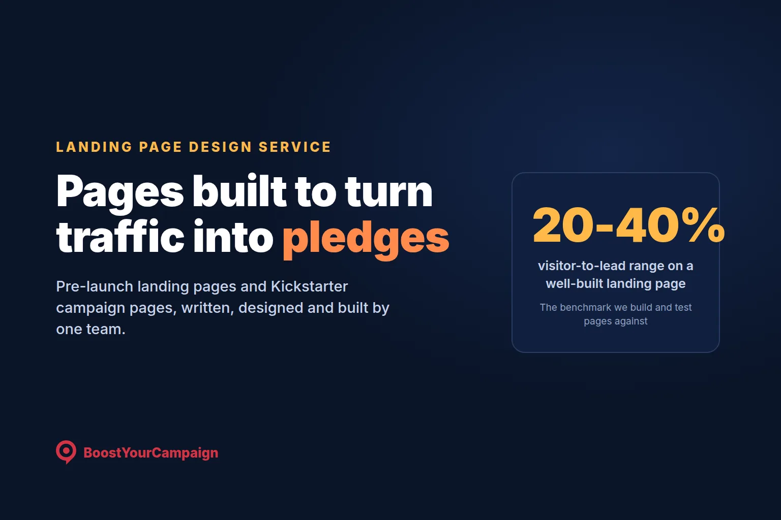
Two different pages have to do two different jobs before a Kickstarter campaign reaches its funding total. The pre-launch landing page turns a stranger who clicked an ad into an email address and, ideally, a small paid reservation. The campaign page turns a warm visitor who already knows the product into a pledge. Treat them as the same page with different headers and both jobs suffer. We build both in-house - copywriting, design and video from the same team - because a landing page written by one vendor and a campaign page written by another rarely agree on the promise or the tone. Since 2010 we have built these pages across more than 4,600 campaigns, helping raise over $734M, with a 4.9/5 score across 300+ verified reviews.
A Kickstarter launch needs two separate pages built for two separate jobs: a pre-launch landing page that converts cold ad traffic into an email address and a $1 to $25 reservation, and a campaign page that converts a warm, already-interested visitor into a pledge. We write and design both in-house, against benchmarks we test - roughly 20 to 40 percent visitor-to-lead on a well-matched landing page, and 1.5 to 5 percent visitor-to-backer on a strong campaign page. Pricing is a fixed fee quoted after we see your product, usually bundled into a pre-launch package.
The two pages every launch needs and what each has to do
Founders sometimes ask why they need a landing page at all when Kickstarter lets you publish a project preview for free. The answer is ownership and traffic. Kickstarter's own project page cannot capture an email address before launch, cannot fire a retargeting pixel, and cannot usefully absorb cold paid traffic - it exists to convert people already browsing the platform, not to be an ad destination. A self-hosted landing page is where ad spend goes for months before launch, where the list gets built, and where the pixel earns launch-week history.
The campaign page is built for a different visitor: someone arriving warm from your list and pre-launch ads, or new traffic Kickstarter's own discovery mechanics send once the campaign is funding well. The job is not to introduce a stranger to a category, it is to close a purchase decision from someone who already has context. A landing page is short and single-minded around one action; a campaign page has to answer a longer list of questions - what is it, does it work, what do I get, who are you, what if it goes wrong - before someone hands over money for something that will not ship for months.
Confusing the two is a common and costly mistake: a landing page stuffed with reward tiers loses the single-minded focus that gets an email address, and a campaign page written like a landing page has none of the proof a careful backer needs. We plan the two as one connected system, not one document copy-pasted twice.
What a pre-launch landing page must contain
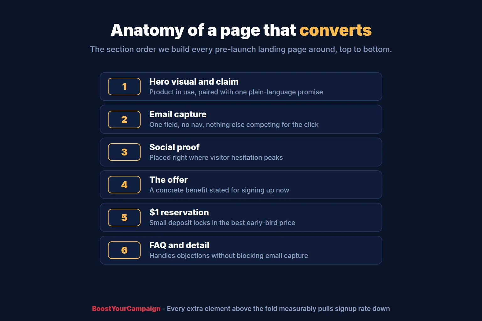
A landing page that converts follows a narrow, tested pattern rather than a creative brief. Above the fold, on a phone screen, a visitor needs to see the product in use - a photo or short clip of it actually working, not a mood shot - paired with one line stating what it is and why it matters, and a single email field with nothing else competing for the click. No navigation bar, no second offer, no autoplay video with sound; every extra element above the fold pulls signup rate down.
Below the fold, social proof belongs at the exact point hesitation peaks, usually the second section, right after a visitor has absorbed what the product does and before deciding whether to trust the people selling it. A live signup counter, a press mention, or founder credibility does more work concentrated in one place than scattered across the page, followed by the offer for signing up, stated as a concrete benefit rather than a vague "notify me at launch." Our annotated pre-launch page examples walk through how this plays out across categories.
Immediately after the email is captured, the highest-converting pages present a second step: the $1 reservation, a small refundable deposit, typically $5 to $25 on our own campaigns, that locks in the best early-bird terms once the campaign launches. This should never be the first thing a visitor sees - asking for money before earning an email address collapses top-of-funnel conversion - but as a follow-on step it captures a share of visitors still on the page a moment later. A short FAQ and light product detail close things out, never ahead of the email capture itself.
On benchmarks: a well-built page sent reasonably well-matched cold paid traffic typically converts somewhere in the 20 to 40 percent range from visitor to email lead, driven mostly by whether the headline states the product plainly, whether the hero visual shows it working, and whether social proof sits at the hesitation point instead of the footer. A page converting meaningfully below that range usually has a structural problem with the offer, headline or traffic match, not something a button-color tweak fixes.
What a Kickstarter campaign page must contain
The campaign page follows a different structure, built around the sequence of questions a skeptical, warm visitor asks before trusting a stranger with money for something that will not ship for months: a hook and one-line promise near the video, the problem in the backer's own words, a demo proving the product does what the headline claims, credibility (team, prior work, prototypes, press), reward tiers written as offers rather than a parts list, a timeline covering manufacturing and shipping, and a risks section that names real risk instead of hiding it. Images and short GIFs carry as much weight as the copy - if a caption says a product folds flat in two seconds, the GIF next to it should show exactly that. Emphasis shifts by category: a tabletop game leans harder on gameplay footage, a hardware product on a before-and-after moment.
On benchmarks: pages written well and sent a warm audience tend to convert somewhere in the 1.5 to 5 percent range from visitor to backer. A page converting below roughly 1 percent usually signals a broken proposition rather than a copy problem worth polishing - the offer, the clarity or the trust is missing. Knowing whether a soft rate points at the page, the traffic or the offer is most of the value of having built hundreds of these pages.
Copywriting: how we write it
Good campaign copy starts before a word gets written. We interview founders for the specific language their earliest backers already use - the frustrating moment a product solves, the objections in pre-launch ad comments, the phrasing people use unprompted in VIP survey answers - and that raw language almost always outperforms anything written in a vacuum. Every claim we write also has to be something the founder can prove: "aircraft-grade aluminum frame, tested to 120kg" earns belief in a way "premium materials throughout" never will, and a claim that cannot be backed by a spec, a test result or a photo gets cut or rewritten.
Reward tier naming gets its own pass. Tiers written as a parts list ("1x device, 1x cable, manual") leave a visitor to do the value math themselves. We name tiers around the outcome and the deal - the retail price shown next to the pledge price so the discount is visible, one tier flagged as the best value so undecided visitors have somewhere to land instead of freezing.
The "why now" is one of the harder sections to get right, and one founders often skip or write defensively. A risks section that reads as evasive undermines trust; naming the real risk and explaining how it is managed signals a founder who has thought the launch through, and a backer paying today for something shipping in eight months needs that reassurance. Our campaign page copywriting guide and guide to who should write your copy go deeper.
Design: how we build it
We start in Figma, building the page as modular sections that map to the copy structure, so copy and design get reviewed together instead of copy getting poured into a finished template afterward. Every build is mobile-first, since most paid pre-launch traffic arrives on a phone: the hero visual is checked for how it crops at phone width before desktop, the email field gets a large tappable target, and headline length is tested for how it wraps on a small screen. Load speed gets the same priority as layout, since an oversized hero image quietly bleeds mobile conversion in a way that never shows up unless mobile analytics get checked separately.
Tracking gets wired in before the page goes live, not added afterward. A pixel and Conversions API go on from day one, so every lead and reservation has a record the ad platform can learn from rather than a number that goes stale once browser privacy settings interfere, and we build in A/B test slots for the headline, hero visual and offer framing from the start, since retrofitting testing onto a page not built for it usually means rebuilding finished sections.
The reservation funnel build
The reservation step is where a plain email list turns into a forecastable one. Immediately after email capture, we present a second offer: a small refundable deposit, typically $1 to $25 depending on the product's price point, that locks in the deepest early-bird discount once the campaign goes live. We usually run this at $5 to $25 rather than $1 flat, because deposit size tunes the filter - a larger deposit produces fewer reservations but each one predicts an actual pledge more reliably.
VIP list mechanics matter as much as the amount. Reservation holders get first access ahead of the general public once the campaign launches, usually by a few hours, and the deposit is either credited toward the pledge or refunded automatically once they back - that refund promise needs to be stated plainly on the offer itself, not buried in a footer FAQ, since a hidden or slow refund suppresses reservations. The reservation list, not the plain email list, is the number we forecast a launch from, since deposit holders convert at several times the rate of plain subscribers. Our reservation funnel guide covers the mechanics and deposit-size tradeoffs, and our pre-launch landing page teardown covers where this step sits in the page flow.
Testing before launch
A pre-launch page is not finished the day it goes live. The headline and hero visual carry the most weight, so they get tested first, before the reservation offer framing or anything further down. Even a modest amount of paid traffic split across two variations, run for a week or two, gives a real read on which version to commit to before the bulk of pre-launch spend goes toward traffic at scale.
We read a page's signals against benchmark ranges rather than a single target number, since performance depends on category, price point and traffic quality; our full benchmarks breakdown covers day-one revenue and conversion ranges. A page sitting meaningfully below the 20 to 40 percent visitor-to-lead range, or a reservation step converting under 10 percent instead of the roughly 10 to 30 percent we typically look for, is a structural signal, not a reason to run the same page longer and hope - usually headline clarity, offer framing, or a traffic mismatch, not a button color. If the product itself has not been tested yet, our guide to validating a product before Kickstarter covers the go, fix or stop thresholds we use before a page is even built.
| DIY page builder | Freelancer | BoostYourCampaign | |
|---|---|---|---|
| Time | Days to weeks, on top of everything else | Days to weeks, dependent on availability | Built into a planned pre-launch timeline |
| Cost model | Template subscription plus your own time | Project rate, copy and design usually priced separately | Fixed fee, quoted after an audit |
| Conversion tracking | Often skipped or added late | Varies; not always pixel-specialized | Pixel and Conversions API wired in before launch |
| Copy | Founder-written, no tested structure | General skill; crowdfunding experience is the exception | Written in-house from founder interviews |
| Testing | Rarely built in; one version, no A/B slots | Depends on the freelancer; often not scoped in | A/B slots for headline, hero and offer from the start |
Pricing model
We price landing page and campaign page work as a fixed fee, quoted after an audit of your product, price point and pre-launch timeline rather than a number pulled off a rate card before we have seen either. The page is usually part of a broader pre-launch package rather than sold as a standalone item, since the landing page, the reservation funnel and the copywriting for both tend to get built together on the same timeline. Where a founder only needs campaign page copy and design because a landing page already exists, we scope that separately - either way, you get a fixed number before work starts.
What working with BoostYourCampaign looks like
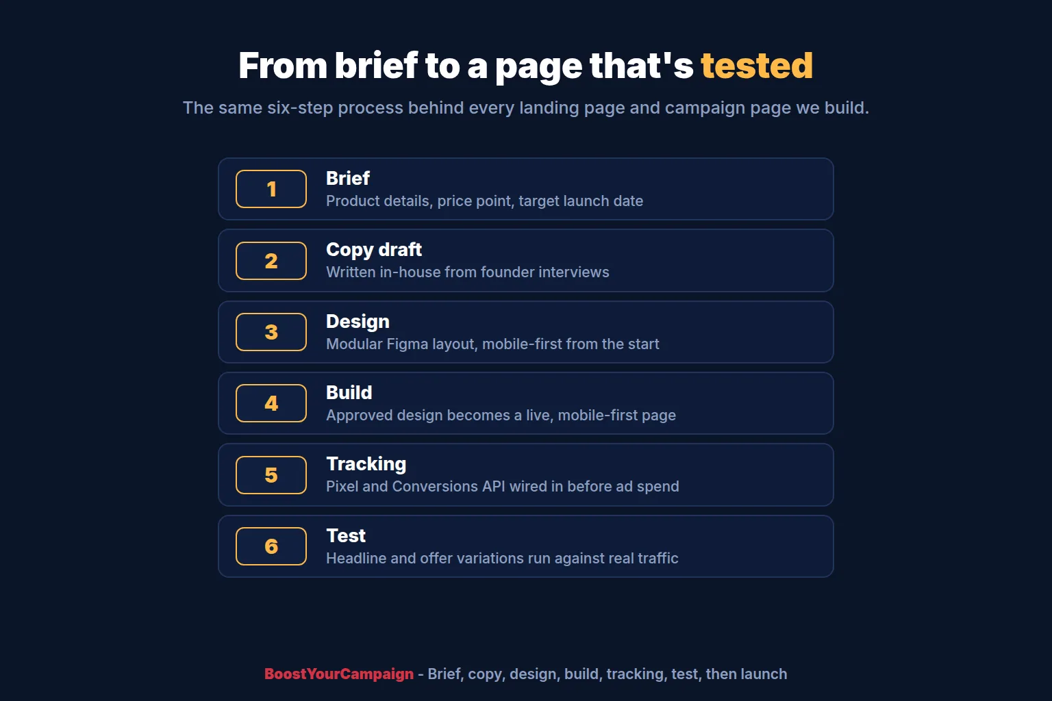
Engagements move through a consistent sequence: a brief gathering product details, price point and target launch date; a copy draft for the landing page and, closer to launch, the campaign page, built from founder interviews; design, moving approved copy into a Figma layout section by section; build, where the design becomes a live, mobile-first page; tracking, wiring in the pixel and Conversions API before any ad spend touches the page; test, running headline and offer variations against real traffic; and launch, where the pre-launch page hands off into the campaign page it was built to support. Our ad management service covers what runs on top once traffic starts, and our video length and cost guide covers how hero footage typically gets produced.
Frequently asked questions
How much does a Kickstarter landing page cost?
We price it as a fixed fee quoted after an audit of your product and launch timeline, usually bundled into a broader pre-launch package rather than billed as a standalone item. What moves the price is mostly the copywriting and design work involved, and whether video needs producing.
What is a good conversion rate for a Kickstarter pre-launch page?
On reasonably well-matched cold paid traffic, a well-built landing page typically converts somewhere in the 20 to 40 percent range from visitor to email lead. A page sitting meaningfully below that usually has a structural issue with the headline, layout or traffic match.
Do I need a landing page before launching on Kickstarter?
Practically, yes, if you plan to run any paid traffic before launch. Kickstarter's own project preview cannot capture an email address or carry a retargeting pixel. A self-hosted page is where pre-launch ad spend goes, where the list gets built and owned, and where the pixel earns the history that makes launch-week ads perform.
What should a Kickstarter pre-launch page include?
A product visual and one clear line of value above the fold with a single email field, social proof placed right after the pitch where hesitation peaks, a concrete offer for signing up, a $1 to $25 reservation step after the email capture, and a short FAQ handling objections.
Can you write my Kickstarter campaign page?
Yes, that is core to what we do. We write campaign pages in-house from founder interviews, built around a tested structure covering the hook, the problem, a demo, credibility, reward tiers, timeline and an honest risks section. The same team handles the landing page copy too, so both carry a consistent promise.
Which landing page builder is best for Kickstarter?
The builder matters less than the structure and tracking behind it. We build pages custom, wired with a pixel and Conversions API from day one and mobile-first by default, rather than starting from a generic template. A purpose-built page usually performs better for reservation funnels and A/B testing.
How long does it take to build a Kickstarter landing page?
It depends on how much copywriting and design the page needs, and whether hero video has to be produced alongside it, but the page is typically built in parallel with the rest of pre-launch planning. Ask us for a real estimate once we know your product and target launch date.
Do you design the images and GIFs for the campaign page too?
Yes. Copywriting, design and video come from the same in-house team, so the images, GIFs and captions are planned alongside the copy rather than sourced separately. Every key claim on the page is meant to be paired with a visual that proves it.
If you want a pre-launch landing page and Kickstarter campaign page built to these benchmarks for your own product, talk to an expert, backed by our client reviews and the full range of launch services we run alongside it.
Ready to give your campaign the best shot?
We've helped 4,600+ creators raise over $734M since 2010. Let's pressure-test your launch plan and find the highest-leverage fixes before you go live.
Talk to an expert →