Want a second pair of eyes on your own pre-launch page before you start driving traffic to it? Talk with BoostYourCampaign and we'll walk through what's working and what's costing you signups.
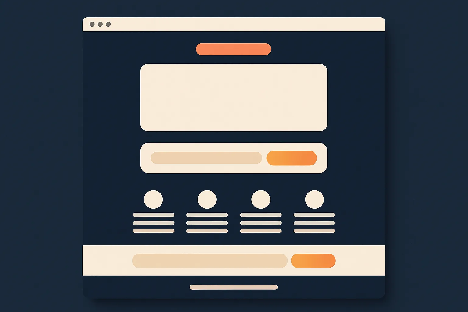
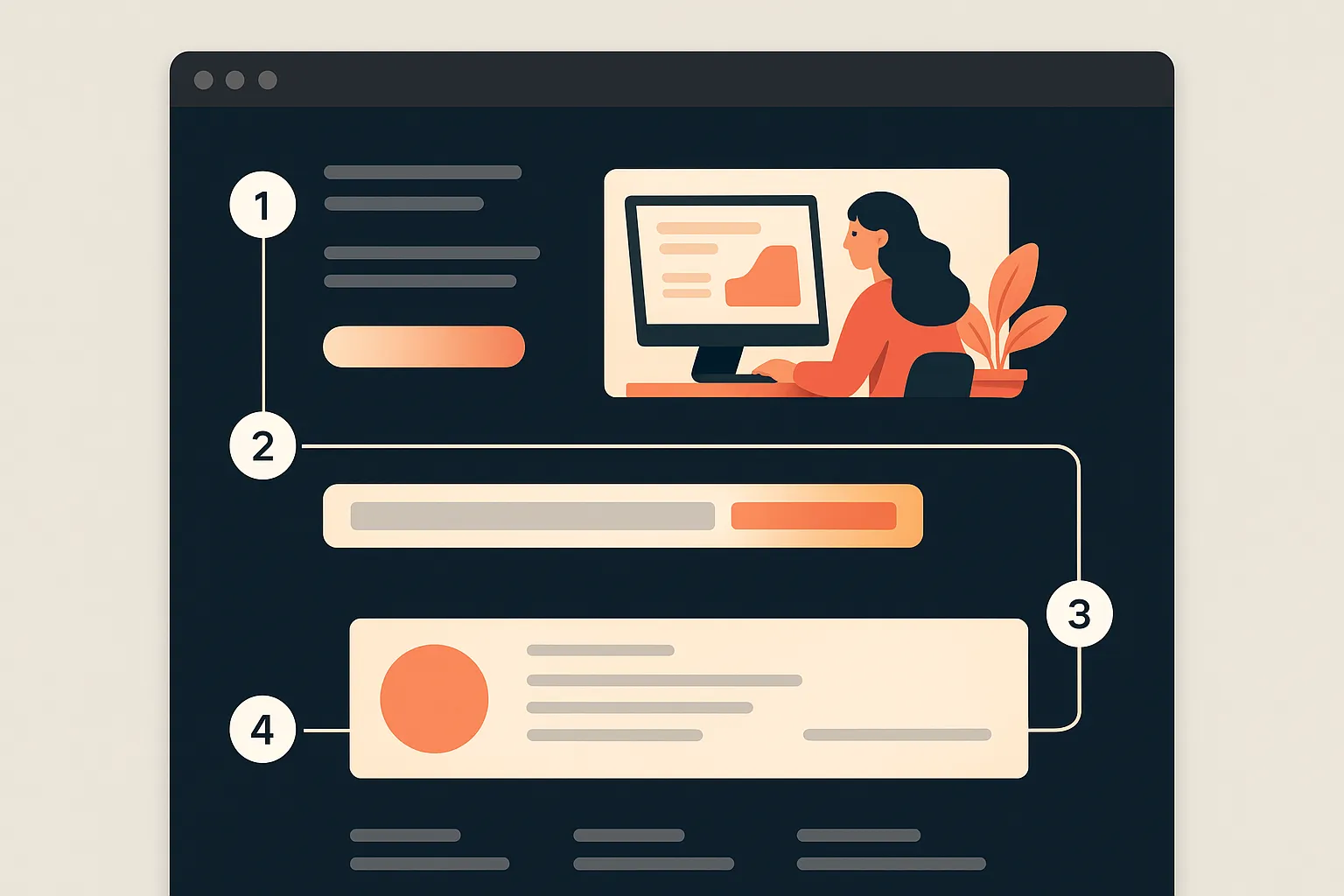
A high-converting Kickstarter pre-launch page almost always has the same five elements: a hero that shows the product in action rather than just describing it, a single clear sentence explaining what it does and for whom, an email capture placed above the fold rather than buried after several scrolls, a concrete incentive for signing up early, and a social proof block that gives a hesitant visitor a reason to trust the page. The examples below aren't screenshots of any specific real campaign - they're annotated archetypes, built from patterns that show up repeatedly across hardware, board game, and design/lifestyle pre-launch pages, described section by section so you can see what each element is doing and where creators commonly get it wrong.
- Five elements repeat across almost every page that converts well - hero, value line, email capture, incentive, social proof.
- Product category changes the emphasis, not the structure - a gadget, a board game, and a design object lean on different elements, but the same five show up on all three.
- Kickstarter has its own native pre-launch page tool - free, built in, but limited in ways worth understanding before relying on it alone.
- A self-hosted landing page gives control the native tool can't - your own data, your own retargeting pixels, your own list you actually own.
- Most experienced creators run both - the native page to capture Kickstarter's own traffic and signal intent, a self-hosted page for everything paid and owned.
- What converts on launch day is decided weeks earlier - the page, the incentive, and the list quality all get set before the campaign goes live.
1) The five elements every high-converting pre-launch page has
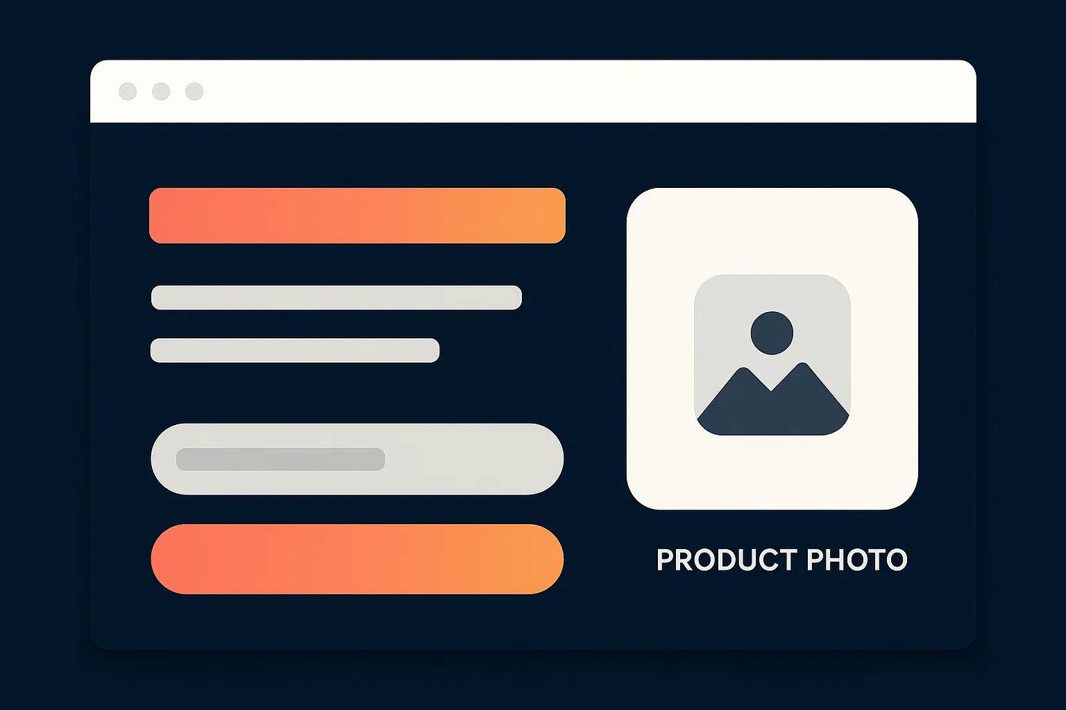
A product-in-action hero. The top of the page, above everything else, needs to show the product doing the thing it does, not sitting still on a white background. A static render of a gadget on a table tells a visitor almost nothing about why it matters. A short looping clip or a strong image of the product mid-use, solving the actual problem it exists to solve, does the entire job of the headline before anyone reads a word.
One clear sentence stating the value. Directly under or beside the hero, one sentence needs to answer "what is this and who is it for" without jargon, without a clever tagline standing in for clarity, and without making a visitor read three paragraphs to understand the product. If someone can't repeat back what the product does after reading that one line, the line isn't doing its job.
Email capture above the fold. The signup field and button need to be visible without scrolling, on both desktop and mobile. Pages that bury the signup form below a long story section lose a meaningful share of visitors who would have signed up if the form had simply been in front of them at the moment of interest.
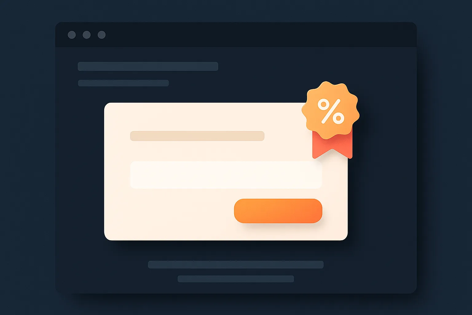
Incentive framing for signing up now. "Notify me at launch" alone is a weak ask. A launch-day discount, a reserved early-bird price, or a guaranteed reward tier for people who sign up before launch gives a visitor a concrete reason to act today instead of bookmarking the page and forgetting about it.
A social proof block. Press logos, a founder credibility line, early reviewer quotes, or a running signup counter all serve the same purpose: telling a skeptical visitor that other people have already looked at this and taken it seriously. Even a simple "X people are already on the list" counter does real work once the number is genuinely worth showing.
These five elements aren't a rigid template to fill in mechanically. They're the jobs a page has to do, in some order, before it can convert a stranger into a name on an email list. The three archetypes below show how those jobs get expressed differently depending on what's being sold.
2) Archetype one: the hardware gadget page
This pattern shows up across consumer electronics, smart home devices, and EDC gear pre-launch pages. It leans hardest on the demonstration.
Hero: a short video loop, five to ten seconds, showing the device performing its core function, usually with a visible before-and-after or problem-solved moment built into the clip itself. The most common mistake here is a hero video that's all cinematic lighting and product beauty shots with no functional demonstration - it looks polished but tells a visitor nothing about what the thing actually does.
Value line: a single benefit-first sentence, almost never a spec list. "Charges your phone in half the time, from a case you already carry" beats "10,000mAh battery with 20W fast charging" for a cold visitor who doesn't yet care about specs, even though the specs will matter later once they're a warmer lead.
Incentive: nearly always an early-bird price tier, framed with a specific discount amount off the eventual retail price and often a limited quantity attached to create real, not fabricated, urgency.
Social proof: founder or engineering credibility (prior product experience, relevant technical background) plus, once available, a press mention or influencer demo clip. Hardware pages that skip this step and rely purely on the product video tend to underperform pages that add even one credible third-party voice.
Common mistake: spec-dumping before establishing the benefit. Visitors who don't yet understand why they'd want the product skip past a wall of technical specifications entirely, no matter how impressive the numbers are.
3) Archetype two: the board game page
Board game pre-launch pages lean on a different kind of demonstration: the experience of playing, not a product feature.
Hero: gameplay footage or high-quality component art showing the table setup mid-game, ideally with visible player reactions or a clear "moment" from the game captured in the shot. A hero showing only the box art and a stack of unopened components, with no sense of what playing actually looks or feels like, is one of the most common misses in this archetype.
Value line: usually genre-and-hook framing - what kind of game this is (deck-builder, cooperative, party game) plus the one twist that makes it different from the games already crowding that genre. Board game backers are often deeply familiar with the category, so vague enthusiasm ("an amazing new experience!") reads as weaker than specific, comparison-literate framing.
Incentive: early-bird pricing again, but often paired with a stretch-goal preview or a promise of exclusive components for early signups, since tabletop backers respond strongly to the idea of getting something later backers won't have access to.
Social proof: designer credibility (prior published games, notable playtesting credentials) and, where available, quotes from tabletop reviewers or influencers who've played a prototype. The tabletop backer community places unusually high weight on whether a game has actually been played and reviewed by someone credible before backing, more so than in most other categories.
Common mistake: leading with theme and lore instead of gameplay mechanics. A rich fictional setting matters to committed backers eventually, but a cold visitor deciding whether to sign up needs to understand what they'd actually be doing during a game session first.
4) Archetype three: the design and lifestyle product page

Design objects, home goods, and lifestyle products follow a pattern built around aspiration and craft rather than function or gameplay.
Hero: a single striking lifestyle image or short clip showing the product in a real, aspirational setting, styled the way the eventual owner would actually use or display it. Overly clinical product photography (white background, studio lighting, no context) undersells this archetype specifically, since the appeal is largely about how the object fits into a life, not just what it technically does.
Value line: usually built around a material, craft, or design decision that separates the product from mass-market alternatives - a specific material, a manufacturing process, or a design philosophy stated in one clear sentence rather than abstract adjectives like "beautifully crafted" that could apply to almost anything.
Incentive: early-bird pricing is common here too, but limited-run framing (a capped first production batch, a founder's-edition color or finish) tends to convert particularly well in this category, since scarcity aligns naturally with a design-forward audience that already values limited or first-run items.
Social proof: designer background, any gallery or publication features, and increasingly, in-progress behind-the-scenes content showing the making process, which builds trust in the craft claim the value line is making.
Common mistake: underselling the price story. Design and lifestyle products often carry a higher price point than gadgets or games, and a page that doesn't address value directly (why this costs what it costs) loses visitors who assume it's simply expensive rather than understanding what they're paying for.
5) Kickstarter's native pre-launch page versus a self-hosted landing page
Kickstarter has its own built-in pre-launch page feature: a "Notify me on launch" project page that goes live before the campaign itself, and it lets visitors sign up to be notified the moment the campaign launches. As of this writing, it's free to use, native to the platform, and Kickstarter automatically emails everyone who signed up the moment the project goes live, which is a genuinely useful nudge on launch day. Since Kickstarter periodically adjusts its creator tools, it's worth confirming the current feature set directly on Kickstarter before building a pre-launch plan entirely around it.
The limitation is ownership. Everyone who signs up through Kickstarter's native page becomes a Kickstarter follower, not a contact you control directly. You can't export that list, can't run your own retargeting pixel against those visitors, and can't reach them if a launch date slips and you want to send an interim update outside Kickstarter's own notification system. If your account or project changes, or you plan a second product later, those signups don't transfer with you.
A self-hosted landing page solves exactly that limitation. Running it on your own domain means real ownership of the email list, full compatibility with Facebook and Google ad pixels for retargeting warm visitors, and complete control over the page's design, copy, and incentive structure without any platform constraints. The tradeoff is that you're building and hosting it yourself, and it doesn't carry any of Kickstarter's own internal traffic or discovery, so 100 percent of the traffic burden sits on you. Our deeper teardown of a converting self-hosted landing page covers the layout and deposit-step details this article doesn't get into.
Most experienced creators run both at once: the native Kickstarter page to capture people already browsing the platform and to signal early intent to Kickstarter's own systems, and a self-hosted landing page as the primary destination for every paid ad, every social post, and every piece of outside traffic, since that's the list you actually own going into launch day.
Kickstarter native page vs self-hosted landing page vs both
| Approach | Control | Data ownership | Ads compatibility | Effort |
|---|---|---|---|---|
| Kickstarter native page | Limited - fixed layout and fields | None - list stays with Kickstarter | No retargeting pixel support | Minimal - built in and free |
| Self-hosted landing page | Full - design, copy, and incentive all yours | Full - your own email list, exportable | Full pixel and retargeting support | Real - needs to be built, hosted, and maintained |
| Both together | Full for owned traffic, fixed for platform traffic | Full for the self-hosted portion | Full, routed through the self-hosted page | Moderate - two pages to maintain, but each doing a distinct job |
6) What to test before launch: headline, incentive, and imagery
A pre-launch page shouldn't be treated as finished the day it goes live. The creators who see the strongest launch-day conversion are usually the ones who spent several weeks testing the page against real traffic before the campaign started, not guessing at what would work.
Headline and value line. Running two or three variations of the one-sentence value proposition against a small, controlled amount of paid traffic reveals which framing actually gets visitors to sign up, well before it matters at scale. A benefit-first line often outperforms a feature-first line, but that's not universal, and testing beats assuming.
Incentive structure. Whether a flat-dollar discount, a percentage-off framing, or a "first 100 backers get X" scarcity mechanic converts better varies by product and audience, and it's worth testing rather than picking whichever framing feels most natural to write.
Hero imagery or video. A static hero image versus a short looping video, or two different product-in-action shots, can produce meaningfully different signup rates. This is usually the highest-leverage element to test, since it's the first thing every visitor sees before reading a word of copy.
None of this needs a large ad budget to test meaningfully. Even a modest amount of paid traffic split across two page variations, run for a week or two, gives a real signal about which version to commit to before the bulk of pre-launch spend goes toward driving traffic at scale.
7) How the email list actually converts on launch day
The entire point of a pre-launch page is the moment the campaign goes live: a warm list of people who already know what the product is, already want it, and just need one email telling them it's time to pledge. The quality of that conversion depends heavily on decisions made weeks earlier, not on anything done on launch day itself.
List size matters less than list quality. A smaller list built from genuinely interested visitors who signed up because the page's value proposition resonated tends to convert at a meaningfully higher rate on launch day than a larger list built from broad, low-intent traffic. This is one of the strongest arguments for testing headline and incentive framing before scaling ad spend: a page that filters for real interest produces a better launch-day list even with a smaller raw signup number.
Timing and sequencing of launch-day emails also matters. A single "we're live" email sent the moment the campaign opens, followed by a small number of well-spaced reminder emails over the following days rather than a single blast, tends to produce a steadier, more sustained flow of early pledges instead of one immediate spike followed by silence. Early, steady momentum in the first 48 hours also feeds into how much organic discovery a campaign gets from the platform itself, since Kickstarter's own algorithm responds to early funding velocity. Our email marketing for crowdfunding campaigns guide covers the specific sequencing and subject-line patterns that tend to perform well here.
For guidance on how long to actually spend building this list before setting a launch date, see our guide to pre-launch timing, which covers realistic ranges by product complexity and audience size rather than a single fixed number.
How BoostYourCampaign fits
BoostYourCampaign has built and tested pre-launch pages across 4,600+ campaigns since 2010, with $734M+ raised total and a 4.9/5 score across 300+ verified reviews visible on the reviews page. That volume matters specifically for pre-launch page work, since it means the patterns described in this article (which hero formats convert, which incentive structures actually move signups, where creators commonly lose visitors) come from testing across a real range of product categories rather than a single campaign's results.
BYC runs a skin-in-the-game ad model, investing its own money alongside the client's ad budget with fixed fees rather than a percentage-of-raise commission, which keeps the incentive aligned specifically during the pre-launch traffic-testing phase this article describes. The agency has owned video production studios in the US and EU for building hero footage and demo content, is a Google Premier Partner and a Facebook Marketing Partner for the paid traffic side of pre-launch testing, and is an Indiegogo Approved Agency and official Shopify Partner as well. For campaigns needing a properly built self-hosted landing page and full pre-launch funnel rather than relying on Kickstarter's native tool alone, that's core to how BYC structures a launch from the pre-launch phase forward.
For a full accounting of the pre-launch to launch-day sequence beyond the page itself, see our pre-launch audience building tactics guide and our Kickstarter reservation funnel guide, which covers how a deposit or reservation step fits into the incentive structure described above.
Want a page like these built for you, with the copy, tracking and the $1 reservation step wired in? See our Kickstarter landing page and campaign page design service.
Frequently Asked Questions
What makes a Kickstarter pre-launch page actually convert?
Five elements consistently show up on pages that convert well: a hero showing the product in action, a single clear value sentence, an email signup field above the fold, a concrete incentive for signing up early, and a social proof block that builds trust with a first-time visitor.
Should I use Kickstarter's native pre-launch page or build my own?
Most experienced creators use both. Kickstarter's native page is free and captures visitors already browsing the platform, but the resulting list belongs to Kickstarter, not you. A self-hosted landing page gives full ownership of the list and full compatibility with retargeting ads, which is where paid traffic should generally be sent.
Does Kickstarter's native pre-launch page notify signups when I go live?
As of this writing, yes - Kickstarter automatically emails everyone who signed up on the native pre-launch page the moment the campaign goes live. Confirm current functionality directly on Kickstarter before building a plan entirely around this feature, since platform tools are updated periodically.
How long before launch should the pre-launch page go live?
It depends heavily on product complexity and how large an audience you're starting from. See our dedicated guide on pre-launch timing for realistic ranges rather than a single number, since a simple product with an existing audience needs far less runway than a complex product starting from zero.
What's the biggest mistake creators make on pre-launch pages?
Burying the email signup form below a long story section instead of placing it above the fold, and leading with specifications or lore instead of a clear, benefit-first value sentence. Both mistakes cost signups from visitors who would have converted if the ask were clearer and more visible.
Should the incentive for signing up early be a discount?
A discount or early-bird price is the most common and reliable incentive, but limited-run framing and exclusive component or color options also convert well, particularly for design-forward or tabletop products. Testing which framing fits your specific audience beats assuming a discount is automatically the strongest option.
Does list size matter more than list quality for launch day?
Quality generally matters more. A smaller list built from genuinely interested signups tends to convert at a higher rate on launch day than a larger list built from broad, low-intent traffic, which is why testing the page's messaging before scaling ad spend is worth the extra time.
Can I use real campaign screenshots as pre-launch page examples to model?
Treat any specific example you find online as one data point, not a template to copy directly, since a page that worked for one product's audience and price point won't necessarily transfer to a different category. The archetypes in this article are built from patterns that repeat across categories rather than any single campaign's specific execution.
How does Kickstarter's pre-launch page and the notify me on launch button work?
Kickstarter's native pre-launch page lets you publish a preview of your project before launch with a notify me on launch button. People who click it get an email from Kickstarter the moment you go live, and creators consistently find that a large share of first-day pledges comes from that list. It works best alongside your own landing page, where you capture email addresses you can actually contact, run ads to, and use after the campaign.
If you want feedback on your own pre-launch page before you start sending traffic to it, reach out through /contact.
Want results like these for your campaign?
We've helped 4,600+ creators raise over $734M. Let's pressure-test your launch plan and find the highest-leverage fixes before you go live.
Book a free strategy call →Get the free 87-step launch checklist
The exact pre-launch, live-campaign and fulfillment steps we use across 4,600+ launches. Free PDF, emailed instantly.
You're in - check your inbox. Open the checklist now ->